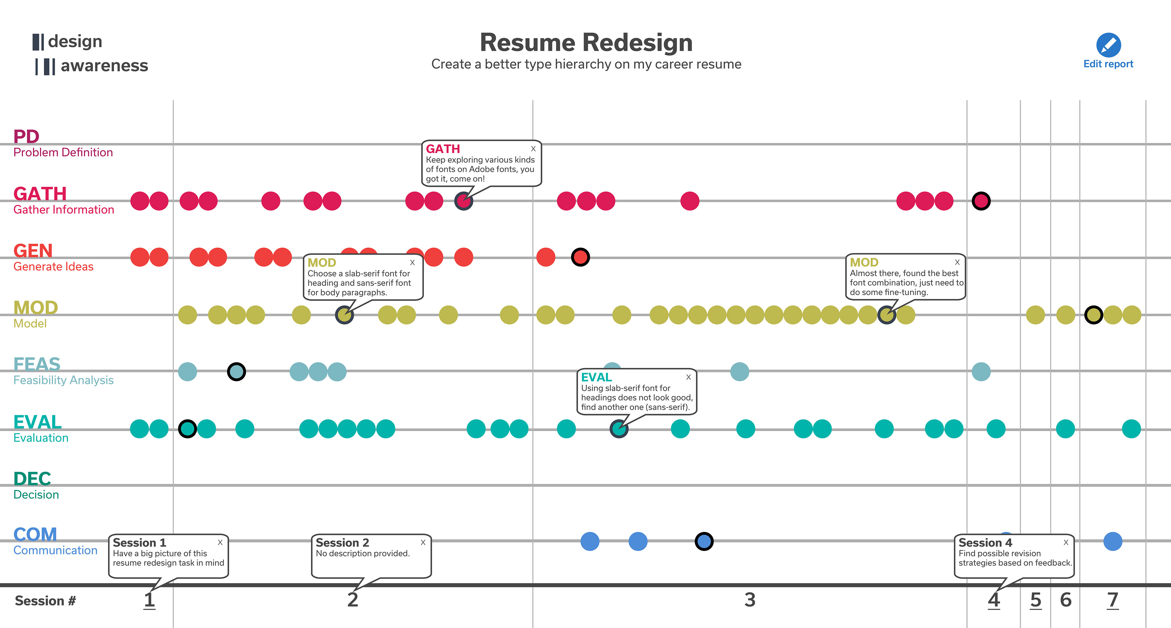
Interactive version:
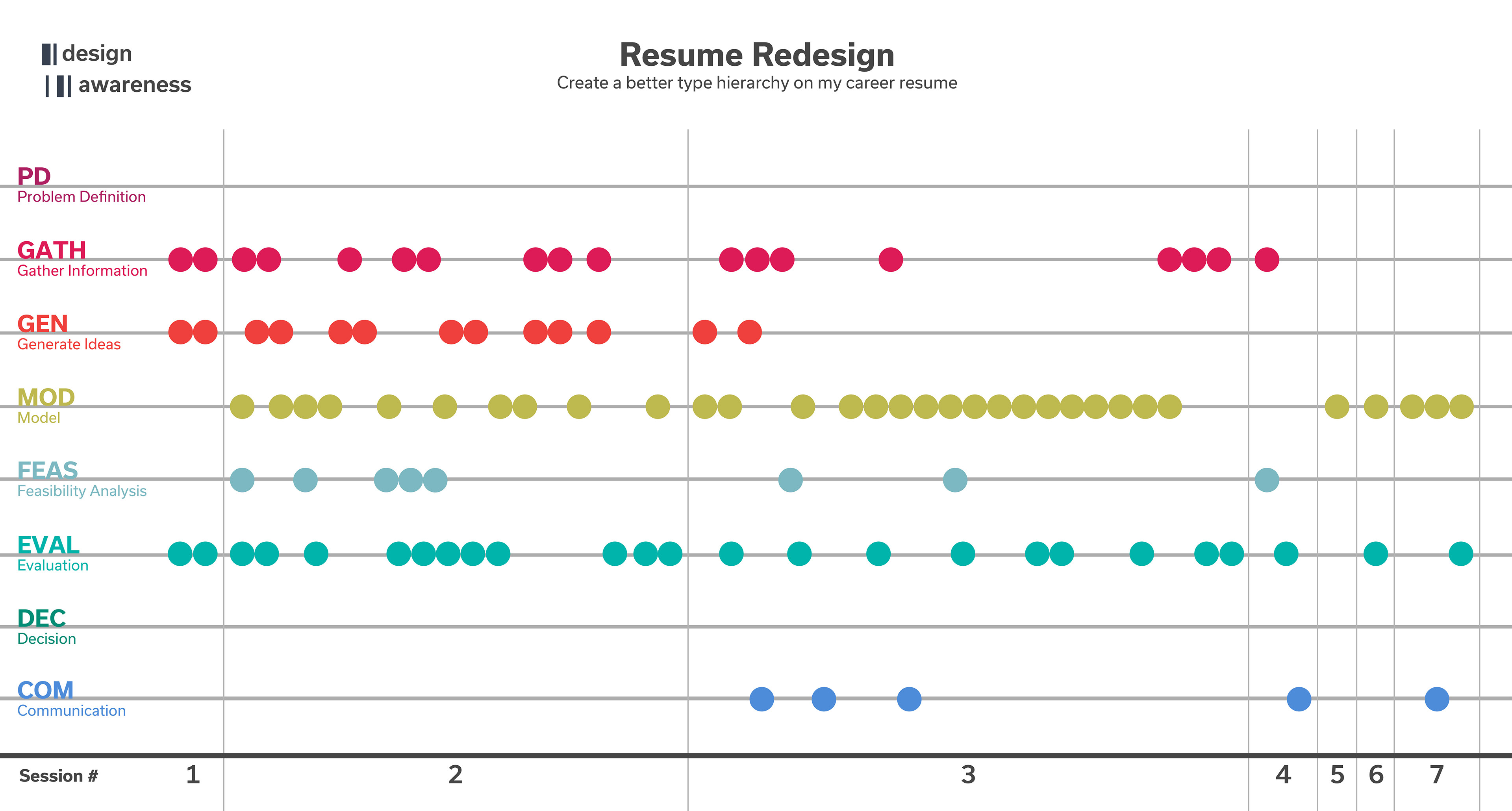
Print/Export version:
Design Rationale
The design timeline report should provoke user's interaction when displayed on computer program, while it should look organized when print on paper.
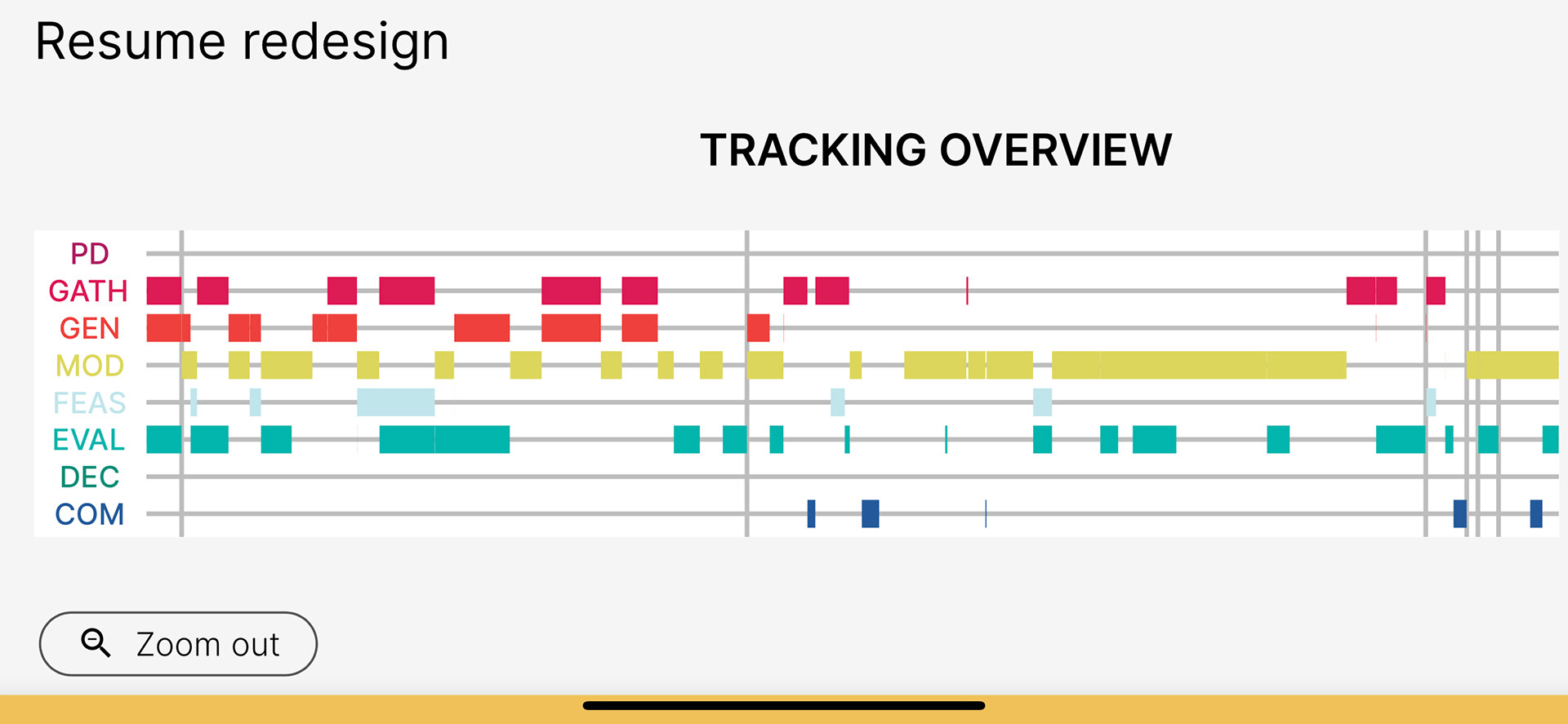
Choosing dots to signify design stage time
• Dots ease user to add/remove dots later (after pressing edit button, just do simple drag and drop dots to the appropriate place).
• To some extent, circle dots looks less intimidating than horizontal bar.
• Dots might lower time precision, but it makes stages (with tiny time) more obvious (such as an important decision that lasts only for 1 second).
Original Information Visualization report screenshot
Research Project Background
Design Awareness
Design awareness can be seen as a state of being in which a designer is attentive to and reflective about their current design behavior. It embodies the practice of being cognizant of the steps one is taking in a design process to enable the designer to make more informed decisions about next steps. Design awareness can help you overcome common design roadblocks like not knowing where to start, or when you have done enough research, what to do next, or even how to know when you are done.
Track our Design Process
Creating a mobile App is useful to help people track and reflect on their own Design Process, with the goal that they become aware of their design process and ultimately become better designers. While the Information Visualization in the App provides an intuitive presentation, I want to extend it further so that it will dynamically reveal text information according to people's curiosity. Thus they felt encouraged to touch to interact with this Information Visualization report.
The Design Awareness concept and its deliverable is part of an on-going research by Dr. Cynthia J. Atman, PhD from University of Washington HCDE department